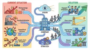
Designing Flipcharts – From your own Design to Professional Visualization

The eye-catcher “flipchart“: No workshop without a flipchart, right?
True. It is the perfect complementary medium to PowerPoint presentations and offers a welcomed change from the linear “slide-by-slide” sequence of this presentation tool. The change of media to the flipchart in particular generates attention. Everything on one sheet, everything in view. You can think big with the flipchart. Keyword: Big Picture. Flipcharts allow spontaneity and are brain-friendly in their presentation. A flipchart is the ideal medium for reaching people, especially by involving them in the development process. So simple, so good!
Don’t be shy! Flipchart design doesn’t have to be beautiful. It’s not about art or illustration, but about developing ideas together step by step under the guidance of a trainer who also acts as a moderator. And the results are impressive. It is not uncommon for the flipchart presentation to be hung up sheet by sheet in a room, always visible, easy to remember – in short: put your meetings on the wall!
And one more thing: you can also design flipcharts online. Simply by having your flipchart next to you during a Zoom or MS Teams meeting. In this context, we would like to mention our esteemed colleague Sandra Dirks, who is very successful in this field.
Designing Beautiful Flipcharts Step by Step: 10 Valuable Tips
Use these flipchart techniques to get your message across in a powerful way. We’ll show you how to create great flipcharts with important content using simple symbols, word and image combinations.
1. Choosing the right material: the basis for effective flipchart design
The quality of the flipchart depends heavily on the materials. A sturdy flipchart stand, blank paper and high-quality wedge pens (e.g. Neuland) are essential. A well-equipped presentation case, including sufficient markers, guarantees that the presentation or workshop runs smoothly.
2. Planning in advance: successfully designing flipcharts
Planning ahead is a key aspect of effective flipcharts. The design can be sketched out in advance on index cards or with a barely visible stroke on the chart itself using a pencil to gain confidence and save time. Pre-prepared flipcharts also make it easier to hold meetings and ensure that everything runs smoothly.
3. Structure is important: clarity and comprehensibility on the flipchart
A clear structure is essential for the effectiveness of flipcharts. You should start with meaningful headings and ensure good legibility. Black outlines should also be used for emphasis. Replacing short texts with concise keywords helps to convey the message clearly and unambiguously.
4. Design the sheet: The visual character of the flipchart
The design of a flipchart is crucial to its effectiveness. You should use text containers to highlight important information and create boundaries. It is also worth experimenting with different shapes and styles to convey the message clearly and attractively and to support the flow of information.
5. Use color purposefully: Designing appealing flipcharts
Colors can reinforce the message and arouse interest. You should use one or two colors plus black for text and grey for shading. It is also advisable to select colors specifically to highlight important information. The colors must also be used consistently throughout. Color coding ensures clear identification of all content.
6. Pay attention to the font: Clarity and legibility for effective communication
A clear, large font written in block lettering is central to the flipchart design. You should normally choose black for the main text, but you can use other colors for highlighting if necessary. The choice of font also influences the “personality” of the flipchart.
7. Different fonts for more transparency: clarity through diversity
Switching between different fonts improves the structure and readability of flipcharts. Larger, bold font for headings and important points, smaller font for additional information and different font styles to indicate types of information can help to convey messages more clearly.
8. Use flipchart as pin board: Interactive design for participant retention
A flipchart can be used as an interactive “pinboard” to increase participant engagement. When people themselves add elements such as post-its, photos or diagrams this invites their participation and promotes a lively discussion. It deepens understanding and promotes a valueable results.
9. Use of symbols and figures: Simple visualizations for clear messages
Symbols and figures can make complex ideas simple and easy to understand, improve structure and increase engagement. They should be easy to understand and contribute to the message and purpose of the flipchart. Simple drawings are almost always more effective than detailed illustrations.
10. Less is more: Effective communication through minimalism
A minimalist design increases the clarity and impact of a flipchart. Cluttered flipcharts can be confusing, whereas white space improves readability and draws the focus to the essentials. Simple presentations and the reduction of the core message to a clear sentence promote comprehensibility and conciseness. A frame around the chart holds everything together.
Collaboration with Professional Visualizers
Of course, our tips do not cover the entire range of options for designing flipcharts. To make the most of these, we recommend working with professional visualizers. In this context, we would also like to draw your attention to other articles on our Blog. Skills such as graphic recording ensure a particularly successful presentation.
The results are recorded graphically in real time and thus visually logged. And if you want to take your own skills or those of your team to the next level, our training programs or in-house meetings provide support.
Conclusion
Flipcharts are currently experiencing a renaissance and not without reason! We hope that this brief guide has given you some interesting food for thought on designing your own flipcharts and would also like to recommend our own services. Because: Whether for flipcharts, pinboards or visual coaching sessions – there are many good reasons for professional visualizations, including
Motivation of people,
emotional appeal,
individual visual language for identification and as a competitive advantage,
long-lasting impact through transparency and clear structures,
content that is quickly processed by the brain.


